In this section, we’ll take a look at the different layout properties you can find at PoshGUI along with their functionalities.
The layout of your app is affected by properties you set on controls like a button and depending on their parent control
Once you select the button or any other control and navigate to the Layout tab in the Properties, you will witness the options of HorizontalAlignment, VerticalAlignment, Width, Height, and Margin.

Horizontal Alignment #
You can set up the horizontal alignment of the control as Left, Right, Stretch (it stretches the control horizontally across the parent container), and Center.
What HorizontalAlignment does is a change to what side of the parent controls the element is aligned
The default option is Left.
Note that setting width with HorizontalAlignment set to Stretch will not stretch the element, removing the Width would be necessary.
The following image shows the different effects HorizontalAlignment has on similar controls:

XAML code of the illustrated layout:
<Window xmlns="http://schemas.microsoft.com/winfx/2006/xaml/presentation" Width="742" Height="397" Content="{Binding message1}" HorizontalAlignment="Left" VerticalAlignment="Top" Margin="0,0,0,0">
  <Grid>
    <StackPanel>
      <Button Content="Left Aligned" HorizontalAlignment="Left" VerticalAlignment="Top" Height="75" Width="150" Margin="0,0,0,0" Background="#50e3c2"></Button>
      <Button Content="Center Aligned" HorizontalAlignment="Center" VerticalAlignment="Top" Height="75" Width="150" Margin="0,0,0,0" Background="#7ed321"></Button>
      <Button Content="Right Aligned" HorizontalAlignment="Right" VerticalAlignment="Top" Height="75" Width="150" Margin="0,0,0,0" Background="#4a90e2"></Button>
      <Button Content="Stretch Aligned (No Width set)" HorizontalAlignment="Stretch" VerticalAlignment="Top" Height="75" Margin="0,0,0,0" Background="#f16a60"></Button>
    </StackPanel>
  </Grid>
</Window>
Vertical Alignment #
It sets up the alignment of the control across the y-axis with respect to the parent container
You can choose the vertical alignment as Top, Bottom, Stretch (it stretches the control vertically across the parent container), and Center.
The default option is Top.
Note that setting height with VerticalAlignment set to Stretch will not stretch the element, removing the height would be necessary.
The following image shows the different effects VerticalAlignment has on similar controls:

XAML code of the illustrated layout:
<Window xmlns="http://schemas.microsoft.com/winfx/2006/xaml/presentation" Width="742" Height="397" Content="{Binding message1}" HorizontalAlignment="Left" VerticalAlignment="Top" Margin="0,0,0,0">
  <Grid>
    <StackPanel Orientation="Horizontal">
      <Button Content="Top Aligned" HorizontalAlignment="Left" VerticalAlignment="Top" Height="75" Width="150" Margin="0,0,0,0" Background="#50e3c2"/>
      <Button Content="Center Aligned" HorizontalAlignment="Left" VerticalAlignment="Center" Height="75" Width="150" Margin="0,0,0,0" Background="#7ed321"/>
      <Button Content="Bottom Aligned" HorizontalAlignment="Left" VerticalAlignment="Bottom" Height="75" Width="150" Margin="0,0,0,0" Background="#4a90e2"/>
      <Button Content="Stretch Aligned (No Height set) " HorizontalAlignment="Left" VerticalAlignment="Stretch" Width="250" Margin="0,0,0,0" Background="#f16a60"/>
    </StackPanel>
  </Grid>
</Window>
Width and Height #
You can set up the Width and Height of the control in this section.
You can also enable the Stretch property completely on the control by setting up the Width and Height to 0.
The following image shows different effects you can achieve with Width and Height settings

Margin #
Margin defines the space of the control between controls around it, including the parent container.
You can set Margin in all four directions of the control.
The following image shows the Margin of 10 enabled on the left and right of the previous button.

Similarly, you can stretch the control vertically with the margin, as shown below:
Below is an illustration of margins between controls in the same parent container;

Fill Parent #
You can also set the control to Fill Parent which will stretch the control vertically and horizontally to cover all the areas of the parent container.
For that, right-click on the control and select Fill Parent from the list as follows:

It will expand the control over the container space as shown below:

It does so by removing the properties Margin, Width and Height and setting HorizontalAlignment and VerticalAlignment to Stretch
Padding #
This property works for the parent container instead of the control.
It ensures the amount of space you want to keep between the control and the container boundaries.
This space remains consistent, even if the size of the parent container is changed.
The following image shows the Padding of 50 enabled on all sides of the Border.
(Remember, as mentioned, it can be applied on the parent container instead of control)

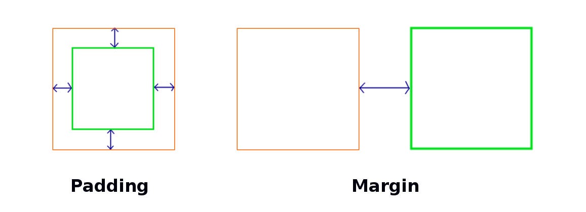
Diffrence between padding and margin #
Below image illustrates the difference between padding and margin:

Parent Controls #
There are three options you can choose from as the parental controls in your application. You can click on them to find more details about them:
Therefore, you can set up amazing layouts of the applications by using these layout options as shown below:

You can load this layout to examine it by pasting below XAML code
<Window xmlns="http://schemas.microsoft.com/winfx/2006/xaml/presentation" Width="800" Height="400" Content="{Binding message1}" HorizontalAlignment="Left" VerticalAlignment="Top" Margin="0,0,0,0">
  <Grid>
    <Grid.RowDefinitions>
      <RowDefinition Height="0.28888888888888886*"></RowDefinition>
      <RowDefinition Height="1.7032967032967035*"></RowDefinition>
    </Grid.RowDefinitions>
    <Grid.ColumnDefinitions>
      <ColumnDefinition Width="auto" MinWidth="71"></ColumnDefinition>
      <ColumnDefinition Width="0.8450371621621622*"></ColumnDefinition>
    </Grid.ColumnDefinitions>
    <Border BorderBrush="Black" BorderThickness="1" Grid.Row="0" Grid.Column="0" Background="#a798e4" Grid.ColumnSpan="2" Grid.RowSpan="0">
      <TextBlock HorizontalAlignment="Left" VerticalAlignment="Top" TextWrapping="Wrap" Text="POSHGUI" Margin="13.0078125,8.1328125,0,0" Foreground="#ffffff" FontSize="30" FontWeight="Bold" FontStyle="Oblique"></TextBlock>
    </Border>
    <TextBox HorizontalAlignment="Left" VerticalAlignment="Top" Height="44" Width="195" TextWrapping="Wrap" Margin="125.015625,45.7890625,0,0" Grid.Row="1" Grid.Column="1"></TextBox>
    <TextBox HorizontalAlignment="Left" VerticalAlignment="Top" Height="46" Width="193" TextWrapping="Wrap" Margin="128.015625,99.78125,0,0" Grid.Row="1" Grid.Column="1"></TextBox>
    <Button Content="Options" HorizontalAlignment="Left" VerticalAlignment="Top" Width="75" Margin="-0.0234375,50.5625,0,0" Grid.Row="1" Grid.Column="0" Background="#838385" Foreground="#ffffff" FontSize="18" FontStyle="Italic"></Button>
    <Button Content="Options" HorizontalAlignment="Left" VerticalAlignment="Top" Width="75" Margin="-0.0234375,88.5546875,0,0" Grid.Row="1" Grid.Column="0" Background="#838385" Foreground="#ffffff" FontSize="18" FontStyle="Italic"></Button>
  </Grid>
</Window>